Top 5 Serif, Sans-Serif and Script Fonts to Use in 2025

Ergun O.
Founder @Behoove
May 5, 2025
/
5 MIN READ

Text
Typography is more than just an aesthetic decision—it sets the tone for a brand, anchors the user experience, and influences how information is perceived.
And while font trends come and go, a few well-designed typefaces continue to rise above the noise. Whether you’re working on a high-end hospitality website, a lifestyle brand, or social content with a bite, your font choices speak volumes—often before a single word is read.
In this guide, we’re breaking down the top 5 serif, sans-serif, and script fonts to use in 2025. These aren’t just trending—they’re thoughtfully designed, versatile, and battle-tested across projects. Some are elegant, some are playful, and a few walk the line between print tradition and digital modernity.
Let’s dive in.
Serif Fonts: Detail, Elegance, and a Touch of History
Serif fonts carry weight, both visually and emotionally. With their roots in print and editorial design, they immediately lend a sense of trust, luxury, or heritage. But the new wave of serifs adds just enough modern flair to feel current—even bold.

1. Juana
Juana is everything we love about a modern serif—refined, flexible, and quietly expressive. It brings an editorial edge that feels equally at home in beauty, fashion, and boutique hotel branding. Sharp serifs and beautifully controlled curves make it feel both structured and soft.
We especially love how well it pairs with minimal sans-serifs like Eina 03 or Neue Montreal. Use it in headlines, section titles, or logo explorations where you want to say elegant, not elitist.
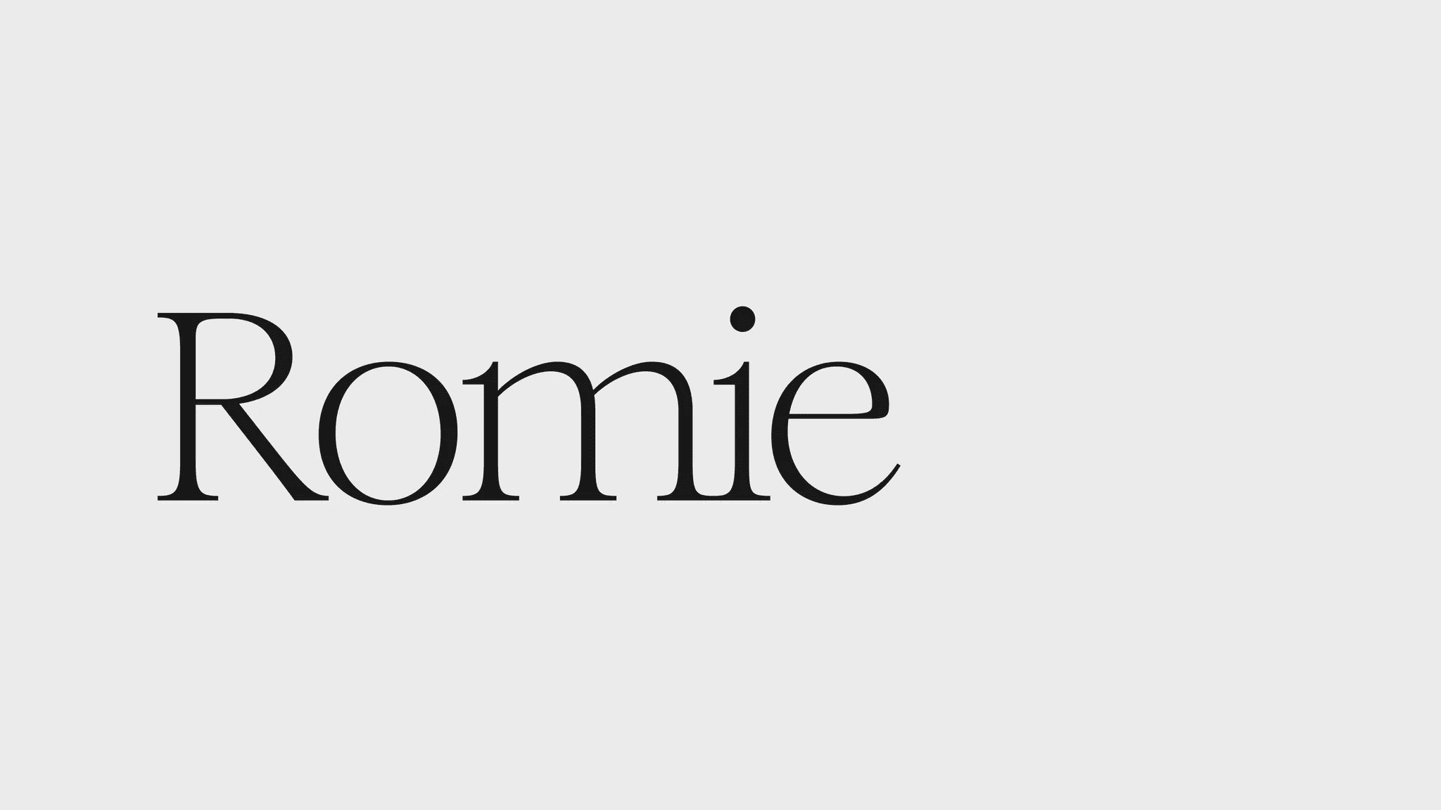
2. Romie
Romie isn’t just beautiful—it’s one of the finest open source serif fonts you can find. With high contrast strokes and a generous x-height, Romie feels timeless without being stuck in the past. The italics are especially expressive and work wonders in storytelling-focused designs.
Ideal for packaging, branding, or long-form editorial content. It looks expensive without being overused.

3. Made Mirage
Looking for something clean, calm, and high-end? Made Mirage is a softer serif that keeps things polished without being too ornamental. We’ve seen this font shine on hotel branding, high-end menus, and spa websites.
Think: linen textures, neutral tones, and minimal elegance. A go-to for hospitality and luxury lifestyle spaces.

4. Behind the Nineties
Now this one is a bit of a wildcard—but in the best way. Behind the Nineties feels nostalgic and modern at the same time. There’s a personality here you won’t find in most serif fonts. It’s sharp yet expressive, almost like someone whispered a hint of a script font into its DNA.
Perfect for cultural projects, fashion zines, or identity work that needs to stand out.

5. Playfair Display
A classic—and for good reason. Playfair Display has become a favorite for social media content, blog headings, and modern brands that want a touch of tradition. It’s reliable, readable, and pairs beautifully with just about any sans-serif.
If you’re looking for an accessible, high-quality serif with broad language support, start here.
Sans-Serif Fonts: Structure, Clarity, and Quiet Confidence
Sans-serif fonts have taken over the digital world, but not all are created equal. The best sans-serifs feel timeless. They’re not just “safe”—they’re quietly confident.

1. Eina 03
Eina 03 feels like a modernist’s dream: geometric, understated, and incredibly legible. What we love about it is how well it plays with stronger serif fonts. It doesn’t compete; it complements.
If you're building a clean UI or editorial layout, this is a reliable anchor. Also perfect for mobile-friendly design.

2. Helvetica Now Display
Helvetica gets a lot of flack—but Helvetica Now Display is a fresh, surprisingly graceful evolution. The spacing has been perfected for digital use. It feels less mechanical and more intentional.
Use it on hero banners, posters, or anywhere you need to convey boldness with clarity.

3. Neue Montreal
Neue Montreal might look like “just another sans-serif” at first glance. But dig deeper and you’ll find a workhorse. It’s insanely flexible, clean without being sterile, and perfect for brands that want a modern edge without screaming for attention.
Plus, it customizes well—letter spacing, weight, optical sizing—it all adapts.

4. TT Hoves Pro
TT Hoves Pro is where modern meets playful. Its subtle curves and controlled geometry make it feel crafted, not generic. It works well for tech startups, clean-cut brands, or editorial layouts that need a bit of warmth.
There’s just enough personality in the curves to separate it from the sea of neutral sans-serifs.
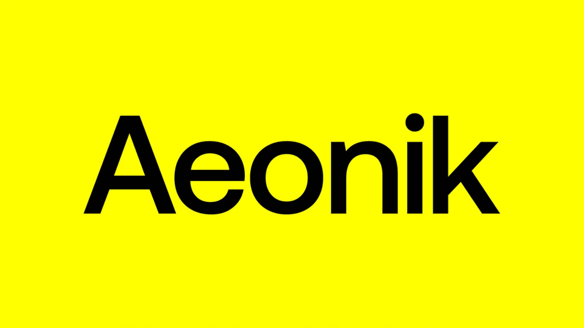
5. Aeonik
This one’s premium—but it earns its price. Aeonik is ultra-refined and super adaptable. We've seen it on architecture studios, fashion portfolios, and even e-commerce sites that want to feel elevated.
It’s the kind of font that quietly carries the weight of a brand.
Script Fonts: Character, Emotion, and a Human Touch
Script fonts aren’t for every layout—but when they work, they really work. Whether you're adding a personal signature, decorating a headline, or creating branding for something boutique, the right script font adds life.

1. Taken by Vultures
Hard to read? Sometimes, yes. But when you need something decorative and atmospheric, Taken by Vultures delivers. It's edgy, fluid, and instantly memorable. Use it sparingly—think posters, social media headers, or packaging that needs to stand out.
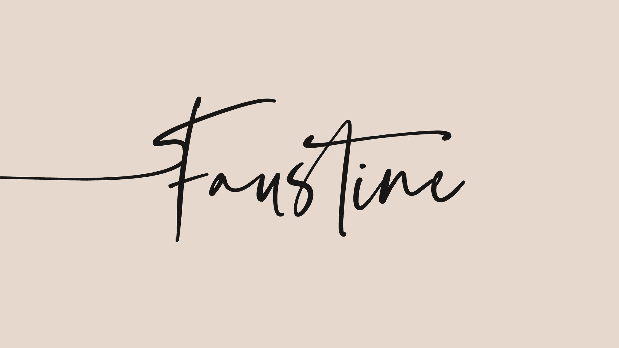
2. Faustine
Faustine isn’t your typical script—it leans more into signature font territory. With fine lines and a clean, elegant flow, it’s ideal for watermarking, personal branding, or adding a hand-touched feel to quotes and testimonials.
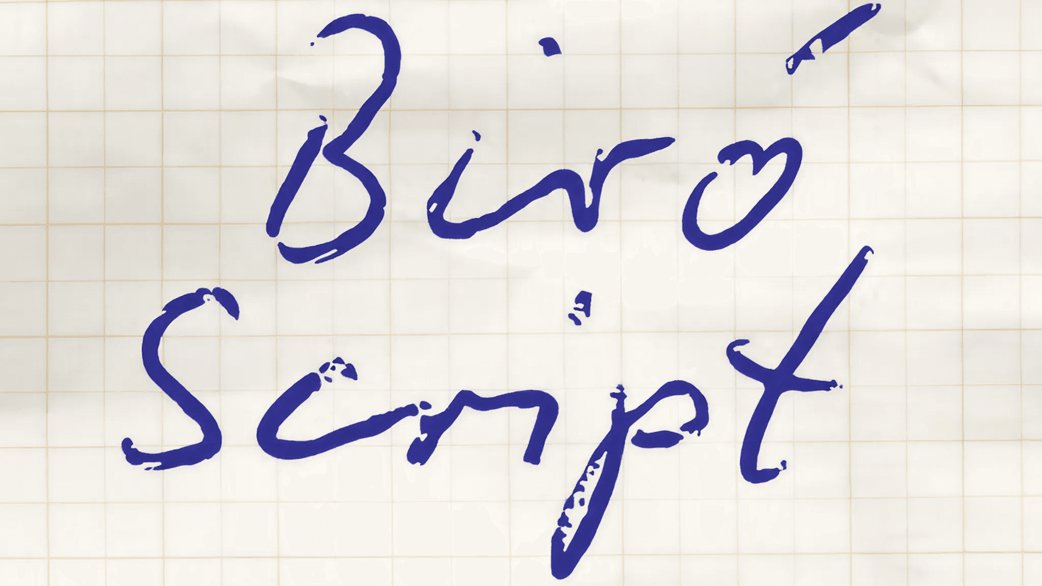
3. Biro Script
A charming handwriting font with a natural flair. Biro Script strikes a balance between legibility and personality, making it great for brand materials, menu designs, or digital planners.
If your brand voice is approachable but thoughtful, this is a match.

4. Golden Hopes
Golden Hopes is one of the most readable of the handwriting-style script fonts in this list. It feels playful without being childish, making it perfect for creative businesses, lifestyle blogs, or brands that want to keep things light.

5. Velocity
Velocity is clean, thin, and elegantly restrained. It's one of those rare script fonts that works even in all caps. Great for quote cards, branding submarks, or even delicate logo work.
Final Thoughts: The Fonts That Will Shape 2025
The right font doesn’t just look good—it supports your tone, reinforces your message, and helps users trust what they’re reading. In 2025, we’re seeing a strong divide between bold, personality-driven typefaces and subtle, neutral ones. The best work happens in that balance: when you pair expressive serifs with muted sans-serifs, or layer in a script font for a handwritten finish.
Use these fonts intentionally. Match them to your audience. And above all, remember: good typography is invisible until it’s wrong. When it’s right, everything just feels… better.
Looking for help matching fonts with your next brand refresh or digital experience?
We’re always here to help you make the right choice—for design that doesn’t just speak, but sings.
News & Articles
Related Articles


Top 5 Serif, Sans-Serif and Script Fonts to Use in 2025
Ergun O.
Founder @Behoove
May 5, 2025
/
5 MIN READ
Text
Typography is more than just an aesthetic decision—it sets the tone for a brand, anchors the user experience, and influences how information is perceived.
And while font trends come and go, a few well-designed typefaces continue to rise above the noise. Whether you’re working on a high-end hospitality website, a lifestyle brand, or social content with a bite, your font choices speak volumes—often before a single word is read.
In this guide, we’re breaking down the top 5 serif, sans-serif, and script fonts to use in 2025. These aren’t just trending—they’re thoughtfully designed, versatile, and battle-tested across projects. Some are elegant, some are playful, and a few walk the line between print tradition and digital modernity.
Let’s dive in.
Serif Fonts: Detail, Elegance, and a Touch of History
Serif fonts carry weight, both visually and emotionally. With their roots in print and editorial design, they immediately lend a sense of trust, luxury, or heritage. But the new wave of serifs adds just enough modern flair to feel current—even bold.
1. Juana
Juana is everything we love about a modern serif—refined, flexible, and quietly expressive. It brings an editorial edge that feels equally at home in beauty, fashion, and boutique hotel branding. Sharp serifs and beautifully controlled curves make it feel both structured and soft.
We especially love how well it pairs with minimal sans-serifs like Eina 03 or Neue Montreal. Use it in headlines, section titles, or logo explorations where you want to say elegant, not elitist.
2. Romie
Romie isn’t just beautiful—it’s one of the finest open source serif fonts you can find. With high contrast strokes and a generous x-height, Romie feels timeless without being stuck in the past. The italics are especially expressive and work wonders in storytelling-focused designs.
Ideal for packaging, branding, or long-form editorial content. It looks expensive without being overused.
3. Made Mirage
Looking for something clean, calm, and high-end? Made Mirage is a softer serif that keeps things polished without being too ornamental. We’ve seen this font shine on hotel branding, high-end menus, and spa websites.
Think: linen textures, neutral tones, and minimal elegance. A go-to for hospitality and luxury lifestyle spaces.
4. Behind the Nineties
Now this one is a bit of a wildcard—but in the best way. Behind the Nineties feels nostalgic and modern at the same time. There’s a personality here you won’t find in most serif fonts. It’s sharp yet expressive, almost like someone whispered a hint of a script font into its DNA.
Perfect for cultural projects, fashion zines, or identity work that needs to stand out.
5. Playfair Display
A classic—and for good reason. Playfair Display has become a favorite for social media content, blog headings, and modern brands that want a touch of tradition. It’s reliable, readable, and pairs beautifully with just about any sans-serif.
If you’re looking for an accessible, high-quality serif with broad language support, start here.
Sans-Serif Fonts: Structure, Clarity, and Quiet Confidence
Sans-serif fonts have taken over the digital world, but not all are created equal. The best sans-serifs feel timeless. They’re not just “safe”—they’re quietly confident.
1. Eina 03
Eina 03 feels like a modernist’s dream: geometric, understated, and incredibly legible. What we love about it is how well it plays with stronger serif fonts. It doesn’t compete; it complements.
If you're building a clean UI or editorial layout, this is a reliable anchor. Also perfect for mobile-friendly design.
2. Helvetica Now Display
Helvetica gets a lot of flack—but Helvetica Now Display is a fresh, surprisingly graceful evolution. The spacing has been perfected for digital use. It feels less mechanical and more intentional.
Use it on hero banners, posters, or anywhere you need to convey boldness with clarity.
3. Neue Montreal
Neue Montreal might look like “just another sans-serif” at first glance. But dig deeper and you’ll find a workhorse. It’s insanely flexible, clean without being sterile, and perfect for brands that want a modern edge without screaming for attention.
Plus, it customizes well—letter spacing, weight, optical sizing—it all adapts.
4. TT Hoves Pro
TT Hoves Pro is where modern meets playful. Its subtle curves and controlled geometry make it feel crafted, not generic. It works well for tech startups, clean-cut brands, or editorial layouts that need a bit of warmth.
There’s just enough personality in the curves to separate it from the sea of neutral sans-serifs.
5. Aeonik
This one’s premium—but it earns its price. Aeonik is ultra-refined and super adaptable. We've seen it on architecture studios, fashion portfolios, and even e-commerce sites that want to feel elevated.
It’s the kind of font that quietly carries the weight of a brand.
Script Fonts: Character, Emotion, and a Human Touch
Script fonts aren’t for every layout—but when they work, they really work. Whether you're adding a personal signature, decorating a headline, or creating branding for something boutique, the right script font adds life.
1. Taken by Vultures
Hard to read? Sometimes, yes. But when you need something decorative and atmospheric, Taken by Vultures delivers. It's edgy, fluid, and instantly memorable. Use it sparingly—think posters, social media headers, or packaging that needs to stand out.
2. Faustine
Faustine isn’t your typical script—it leans more into signature font territory. With fine lines and a clean, elegant flow, it’s ideal for watermarking, personal branding, or adding a hand-touched feel to quotes and testimonials.
3. Biro Script
A charming handwriting font with a natural flair. Biro Script strikes a balance between legibility and personality, making it great for brand materials, menu designs, or digital planners.
If your brand voice is approachable but thoughtful, this is a match.
4. Golden Hopes
Golden Hopes is one of the most readable of the handwriting-style script fonts in this list. It feels playful without being childish, making it perfect for creative businesses, lifestyle blogs, or brands that want to keep things light.
5. Velocity
Velocity is clean, thin, and elegantly restrained. It's one of those rare script fonts that works even in all caps. Great for quote cards, branding submarks, or even delicate logo work.
Final Thoughts: The Fonts That Will Shape 2025
The right font doesn’t just look good—it supports your tone, reinforces your message, and helps users trust what they’re reading. In 2025, we’re seeing a strong divide between bold, personality-driven typefaces and subtle, neutral ones. The best work happens in that balance: when you pair expressive serifs with muted sans-serifs, or layer in a script font for a handwritten finish.
Use these fonts intentionally. Match them to your audience. And above all, remember: good typography is invisible until it’s wrong. When it’s right, everything just feels… better.
Looking for help matching fonts with your next brand refresh or digital experience?
We’re always here to help you make the right choice—for design that doesn’t just speak, but sings.
We're an Istanbul-based design studio that blends aesthetics & functionality to innovate the past, elevate the present, & integrate the future.
We're an Istanbul-based design studio that blends aesthetics & functionality to innovate the past, elevate the present, & integrate the future.
We're an Istanbul-based design studio that blends aesthetics & functionality to innovate the past, elevate the present, & integrate the future.